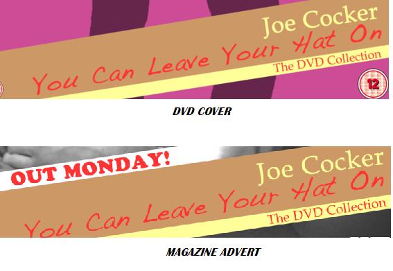
I think that our final media product adapts to the coventions our group set out to do.Upon completing research,
we knew what codes and conventions we should try to include in our final products to make them meet a specific type of
product.An example of this is in the magazine adverts i analysed i found that they all featured a large image of some sort
either as the background or to accompliment the text, the text and background were always contrasting, either light text on
a dark background or dark text on a light background, to make the text stand out and draw your attention. These are examples
of things i found in my research which we tried to incorporate in our final magazine advert. The use of colour on a black
and white blackground was really effective and made the text stand out more, with the main image of the advert as the background.

1. The use of media company logo's makes our magazine advert look even more realistic. HMV, Itunes and Play.com were the ones we chose and shows the audience where they
can download, order or view information on the track we used for our music video.
2. Most adverts advertising artists or songs these days have a website where you can find out information on the artist(s) or download their music, so we included a website.
3. CD Cover's are made to have age rating's on them in this day and age, so we thought we would include our chosen age rating for our video on the advert incase an audience would like to know before hand.
4. The main image of the advert is a large black and white background image which dominates the advert, the person on our image is Mitch from our group, the way he is sitting and the expression on his face
suggests erotic connotations and objectifies him, this also features at some points in our video. This could link to Laura Mulvey's 'Male Gaze' Theory however it does not objectify a female seen from a male viewpoint but objectifies a male, seen from a female viewpoint.
5.The light brown banner contrasts from the yellow and red text, which attracts more attention from the audience.
6. Adding a different colour border to the 'features' star makes it slightly more attractive for the viewer to look at.
As mentioned at the start of the evaluation i feel that our final media product accomodates the codes and conventions i found through my research. When i was watching Foo Fighters Featuring Jack Black video for the song Low, i felt as if i was watching it for diversion purposes, with not much in common between the viewer
and the artist(s), this ties in with the terms of the Blumner and Katz Theory, like escaping from a day to day normal routine. We wanted to interprete our video in this same way,
sharing parody style conventions of videos.Along with this theory we also looked at Andrew Goodwin's theory, Andrew Goodwin has identified a number of key features which distinguish the music video as a form such as a relationship between the lyrics and the visuals, with the visuals illustrating, amplifying or contradicting the lyrics and
a relationship between the music and the visuals, with the visuals illustrating, amplifying or contradicting the music. We feel that our video reflects this however it could be argued that we did not accomodate to this convention as we were not always miming or saying what the lyrics were saying (See number 7 in image below), this may be down to us also including outtakes in our video.
We did follow Goodwin's theory in the sense that the main singer (Rob) was shown alot throughout the video and were always from close up angle's, which was one of his theory's aspects, following the continual close up of the main singer (See number 8 in image below).

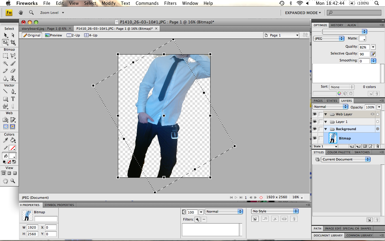
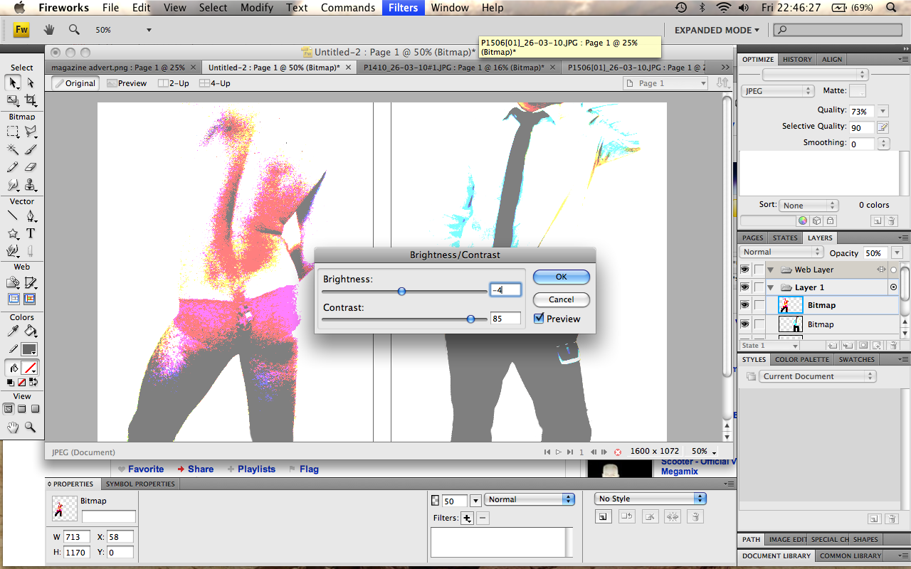
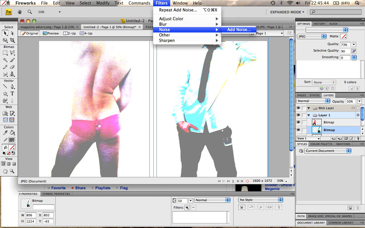
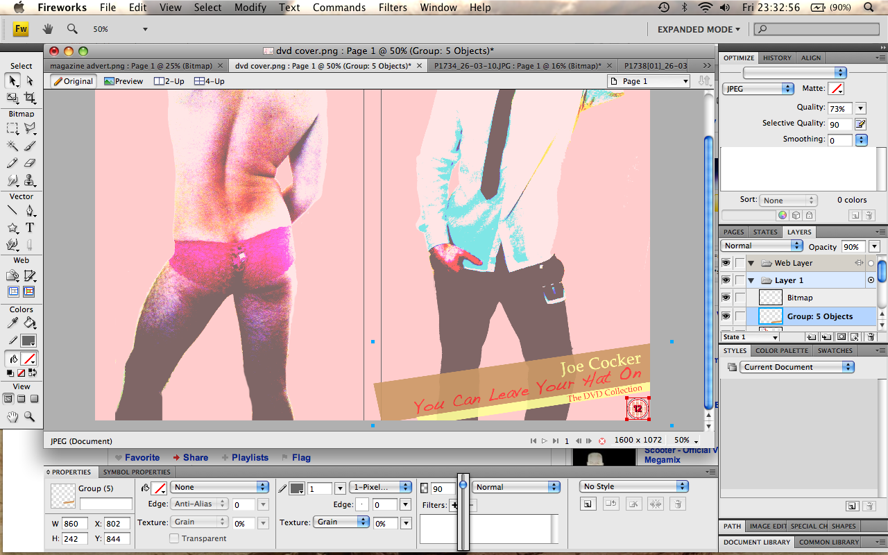
As for our DVD Cover, inside we used two images on either side of the cover rather than having a pattern, the front and back of two of the featured characters, this goes against the conventions of the genre of the music we did where there is usually
pictures of the artist/band playing live or as mentioned a pattern or blank. From both the inside and out of the DVD cover, people may be able to guess the genre of the video,
because of this the audience are likely to guess what the video will feature before they've even seen it, which helps us to draw in an audience. Our video and products did not fully turn out how we wanted them to due to limited equipment and funding,
an example of this is that the pixel quality of the video is not great, so it was hard to make it look proffesional, this may be due to the quality of the equipment or the fact that alot of the video was rushed. However a good point is that it challenges the conventions of
a normal music video because at the beginning there is other music instead of there just being the main song or random noise. The problems we had for time, equipment and funding also works against us as this does not meet the normal conventions of our chosen genre.
However, our video does have a strong relationship between performance and narrative, switching between scenes of performing and the comedy side such as the stripping scenes, this backs up Steven Archer's music video theory that a video needs a good relationship between performance
and narrative, it also needs to market both the song and the band in general.
How effective is the combination of your main product and ancillary texts?
Our DVD cover and magazine cover compliment our music video very well, as they keep in with the genre of our video. An example of this is our magazine cover features my group on the front cover wearing stupid hats and standing in a silly posture. As for our magainze, our finished product contains all the stereotypical codes and conventions of a music magazine cover, with large headline, barcode, price, issue number etc. The DVD cover also features a funny picture of Joe cocker on the front, which as said goes in line with the spoof side of our video. If our magazine were to be made real, similarly to our music video our audience would read it for escapism purposes.
What have you learnt from your audience feedback?
The majority of the audience who gave us feedback to our video found it very amusing and gave us positive feedback, saying it fitted the purpose of the genre. The outtakes were also mentioned for adding more comedy to our video and that the only improvements to be made was less of the bath scene where time lapse is attempted quite well. People said that they thought the target audience of our video was mainly for females, particularly to those of teen ages. They would have also liked to have seen more stripping in the sense of more people stripping as opposed to Mitchell going any further than he already did. However, Rob and me did not feel comfortable enough to take our clothes off. As a group we believe that the video is aimed at no particular audience, however the content is more likely to be attractive to females. As the video is a parody it is hopefully appealing to anyone, particularly fans of Joe Cocker and the full monty..
How did you use new media technologies in the construction and research, planning and evaluation stages?
The use of websites like you tube were vital to the success of our video, we used examples of other peoples funny videos to come up with ideas and the use of editing with final cut made our video look even more funny, such as the scene where the video freezes and zooms in on the guitarists face. Since our video has been on you tube it has received over 2,500 hits within a month which a 4.5 out of 5 rating which we consider to be very good. We also used the internet to research age classifications so that we knew what sort of age ratings we should give our music video and DVD, and found a useful document on the BBFC website which led us to rating our video 18 due to some of the explicit content. We also used the internet and Film books in an attempt to research camera techniques that we could use in our music video, to make it more interesting.The internet was also helpful for finding pictures for our magazine and DVD covers.


